How to Choose Paint Colors for Different Rooms: Undertones & Natural Light

Every interior designer has witnessed the "swatch shock" phenomenon: a paint color that looked like a sophisticated warm greige in the store turns muddy pink or icy purple once painted across an entire living room wall. Paint colors are not static; they are reflective pigments that absorb and bounce ambient wavelengths of light. Selecting the right paint requires analyzing the directional orientation of your windows (North, South, East, West), identifying hidden undertones, and testing large-format samples under real residential lighting conditions.
Matching Paint Colors to Window Compass Directions
The natural daylight entering your rooms changes temperature based on compass orientation:
- North-Facing Rooms: Receive cool, bluish, indirect light throughout the day. Cool grays and blue-whites will look icy and grim. Balance north light with warm creams, gentle ochre undertones, or rich earthy terracotta.
- South-Facing Rooms: Bathed in intense, golden, warm light all day. These spaces can handle almost any color, including cooler slate blues, crisp sage greens, or soft neutrals without feeling cold.
- East-Facing Rooms: Bright, warm, yellow-gold morning light followed by cooler afternoon shadows. Earthy neutrals with slight green or warm beige undertones stay balanced throughout the shift.
- West-Facing Rooms: Cool dull light in the morning, shifting into intense, hot reddish-orange light in late afternoon. Soft off-whites with neutral or slight grey undertones prevent afternoon overheating.
The 48-Hour Sampling Protocol: Do Not Paint Small Swatches on the Wall
Never paint small 6x6-inch squares directly onto your existing wall color, as your eye will judge the sample against the background color rather than evaluating its true hue.
Instead, paint large 24x36-inch peel-and-stick sample boards or foam-core boards with two full coats. Move the boards to all four walls throughout the day, observing them at 9:00 AM (morning sun), 2:00 PM (peak daylight), and 8:00 PM (artificial 2700K lighting).
- ✓Paint at least two 24x36-inch sample boards per candidate color.
- ✓Observe samples next to trim, flooring, and sofa upholstery.
- ✓Verify that sheen level (flat, eggshell, satin) matches the final intended application.
- ✓Check color rendering with artificial 2700K ambient lighting in the evening.
Frequently Asked Questions
Expert clarifications and real-world considerations
Editorial Summary
Choosing paint colors with confidence comes down to understanding light orientation and respecting undertones. Take the time to sample large movable boards across shifting day and night lighting, and create a harmonious, serene color story throughout your home.
Written by Elena Vance
Staff ContributorWith over 14 years in residential spatial planning and interior architecture, Elena specializes in small-space optimization, biophilic textures, and lighting design.
Related Architectural & Home Guides
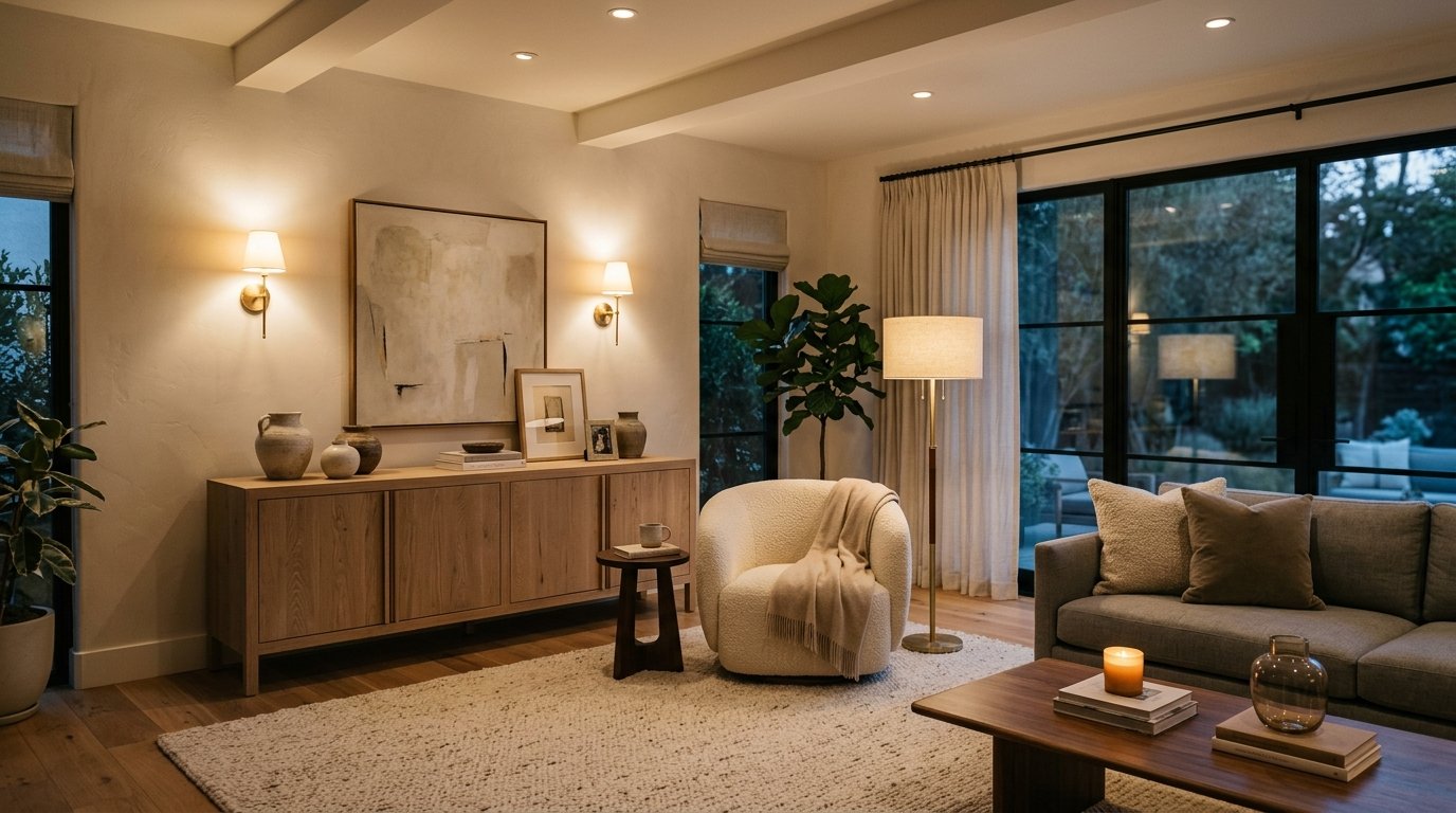
How to Choose the Right Lighting for Every Room: Kelvin, Lumens & Layering
Lighting is the most transformative yet frequently misunderstood element of interior design. Discover how to calculate lumens per room, balance color temperatures, and create a 3-layer lighting scheme.
How to Create Better Natural Lighting at Home: Daylight Harvesting & Glare Control
Natural sunlight elevates serotonin, regulates sleep cycles, and brings interior architecture to life. Discover how to harvest natural daylight, eliminate harsh glare, and illuminate dark rooms without adding artificial fixtures.

Modern Interior Design Ideas That Still Feel Warm, Livable & Tactile
Modern design often gets unfairly labeled as cold, sterile, or clinical. By blending clean architectural lines with organic materials, tactile textiles, and warm ambient palettes, you can achieve a modern interior that feels calm, grounding, and deeply welcoming.
Practical Ideas for Better, Smarter Living
Join our readership of homeowners, spatial architects, and living enthusiasts. Receive thoughtful architectural breakdowns, energy-saving insights, and curated home guides every Thursday.